Create an Animated Border with Tailwind CSS
The border property in CSS cannot be animated natively. However, we can simulate this effect by using a div with an animated background and placing the content inside a child element with padding, which will act as the “thickness” of the border.
This method might seem complex for those who don’t frequently work with CSS or frameworks like Tailwind CSS, but you’ll see that it’s not that difficult and the final result is quite satisfying.
Types of Gradients in CSS
To achieve our animated border effect, we need to know the different types of gradients in CSS:
- Linear Gradient: Linear gradient along a specific direction.
- Radial Gradient: Radial gradient from a central point outward.
- Conic Gradient: Conic gradient around a central point, creating a “wheel” effect.
For our animated border, we’ll use conic gradient, as it allows us to create a spinning effect.
Implementing the Animated Border
<div
  class="w-full max-w-lg bg-conic/[from_0deg] from-white to-white dark:from-black via-green-400 dark:to-black  rounded-2xl p-px"
>
  <div class="p-10 rounded-2xl bg-transparent">
    <p class="text-white text-center font-semibold ">
      Parent container background
    </p>
  </div>
</div>
Parent container background
If we add a background to the child container, we achieve the border effect:
<div
  class="w-full max-w-lg bg-conic/[from_0deg] from-white to-white dark:from-black via-green-400 dark:to-black rounded-2xl p-px"
>
  <!-- Parent container -->
  <div class="p-10 rounded-2xl dark:dark:bg-zinc-900 bg-mint-50">
    <!-- Child container -->
    <p class="text-white text-center font-semibold">
      By adding a background to the child container, we achieve the border effect
    </p>
  </div>
</div>
By adding a background to the child container, we achieve the border effect
Adding Animation with @property
We’ll use @property to define a custom property that will allow us to animate the border:
@property --border-angle {
  syntax: "<angle>";
  inherits: false;
  initial-value: 0deg;
}
Then, we create the animation with @keyframes and add it to the Tailwind CSS theme:
@theme {
  --animate-rotate-border: border-rotate 3s linear infinite;
  @keyframes border-rotate {
    to {
      --border-angle: 360deg;
    }
  }
}
Now we’ll implement it in our parent container classes:
<div
  class="w-full max-w-lg bg-conic/[from_var(--border-angle)] from-white to-white dark:from-black via-green-400 dark:to-black animate-rotate-border rounded-2xl p-px"
>
  <div class="p-10 rounded-2xl bg-transparent">
    <p class="text-white text-center font-semibold">
      Animated parent container background
    </p>
  </div>
</div>
Animated parent container background
This is how it looks with a background in our content
Adjusting the Border Thickness
By modifying the padding, we can control the border thickness:
<div
  class="w-full max-w-lg bg-conic/[from_var(--border-angle)] from-white to-white dark:from-black via-green-400 dark:to-black animate-rotate-border rounded-2xl p-[3px]"
>
  <div class="p-10 rounded-2xl dark:bg-zinc-900 bg-zinc-50">
    <p class="text-white text-center font-semibold">
      By adjusting the padding we can "increase the border thickness"
      <br />
      <code>p-[3px]</code>
    </p>
  </div>
</div>
By adjusting the padding we can "increase the border thickness"
p-[3px]
Customizing the Gradient
In Tailwind CSS, we can control the position of the gradient colors:
from-*→ Starting color of the gradient.via-*→ Intermediate color.to-*→ Final color of the gradient.
We can also adjust the color positions, for example:
<div
  class="w-full max-w-lg bg-conic/[from_var(--border-angle)] from-white to-white dark:from-black via-green-400 dark:to-black from-30% to-60% animate-rotate-border rounded-2xl p-px"
>
  <div class="p-10 rounded-2xl bg-transparent">
    <p class="text-white text-center font-semibold">
      By adjusting the color positions we achieve a different effect
      <br />
      <code>from-30% to-60%</code>
    </p>
  </div>
</div>
By adjusting the color positions we achieve a different effect
from-30% to-60%
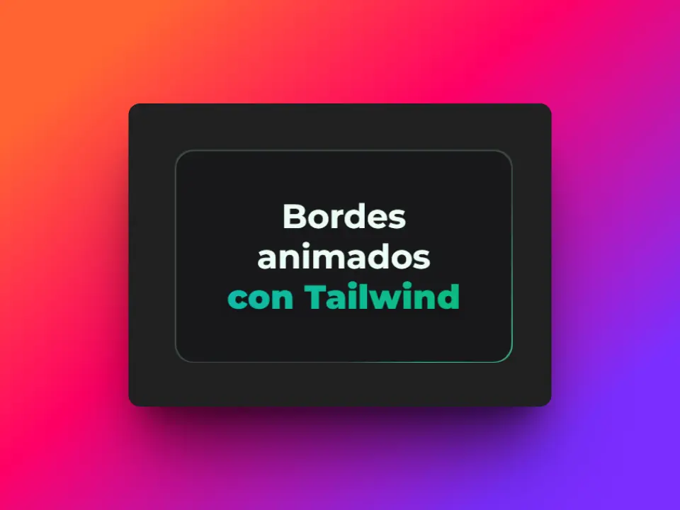
Final Result
I’ll make some small adjustments, changing the from and to colors to achieve a more natural effect. Also, I’ll use a 1px padding.
<div
  class="w-full max-w-lg bg-conic/[from_var(--border-angle)] from-green-200/20 via-green-400 to-green-200/20 from-30% to-60% animate-rotate-border rounded-2xl p-px"
>
  <div class="p-10 rounded-2xl dark:bg-zinc-900 bg-zinc-50">
    <p class="text-white text-center font-semibold">
      This is the final result
    </p>
  </div>
</div>
This is the final result
Conclusion
I hope this guide has helped you understand how to create an animated border with Tailwind CSS and that you can implement it in your projects. Experiment with gradients and animations to get unique effects! 🎨✨